
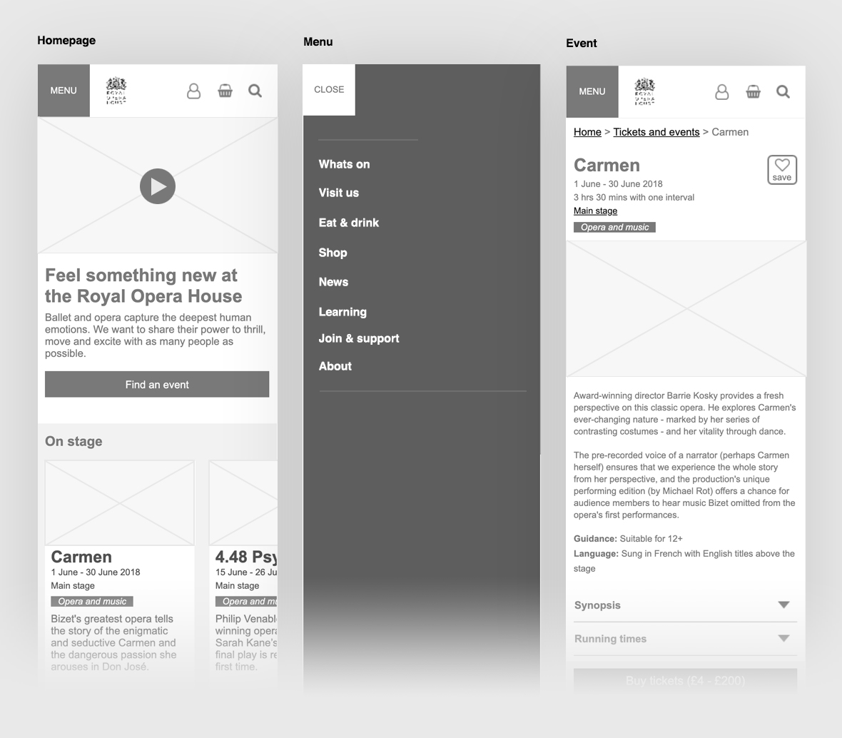
- The project evolved around the new ballet imagery that was shot using stop motion. The design process took many iterations finessing the UX journey and then creating visual designs that were less content heavy and minimal.
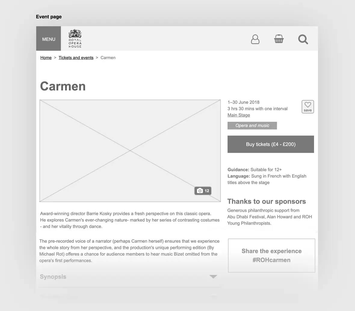
- Refining UX journey
- Working on different layout concepts for web and mobile
- Developing colour palette and brand guidelines
- Aligned project goals with research findings
Skillset: UI and UX
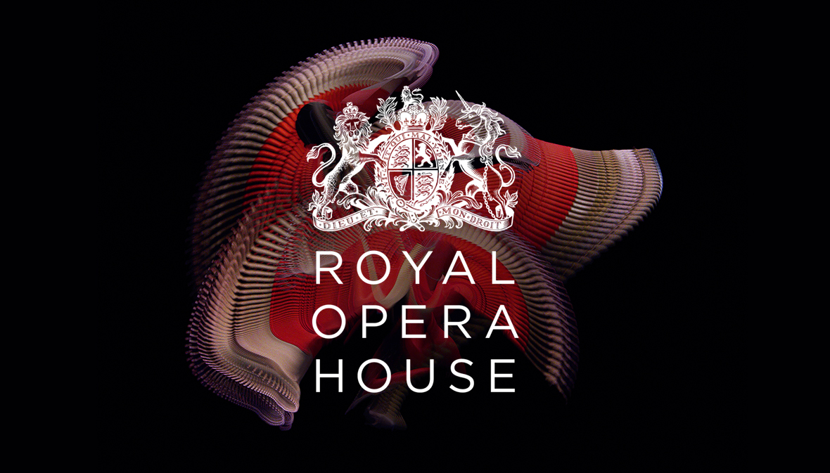
Client: Royal Opera House
Agency: Atomic
Website: www.roh.org.uk
Deliverables:
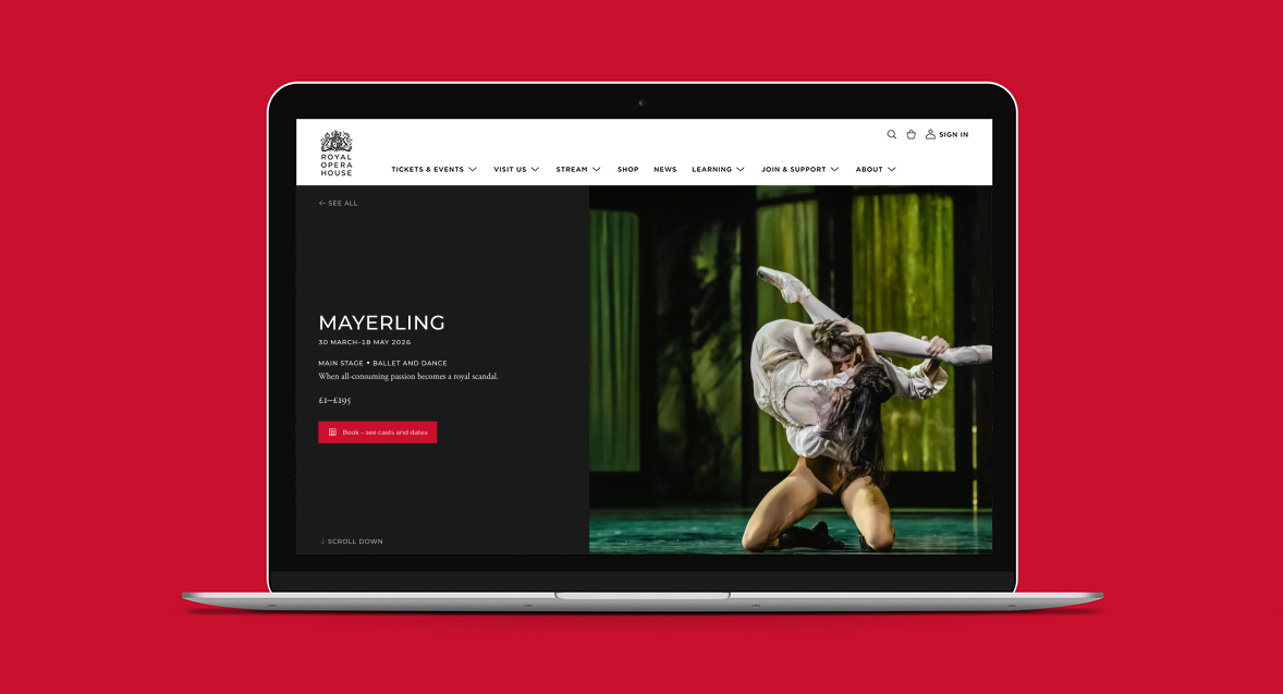

Restructuring the UX journeys was the focus initially. Looking closely at ways to improve the overall user experience throughout. A more minimal approach was considered and a focus on impactful imagery. Stripping much of the content back and directing the user to ticketing pages clearly.
Working on a new colour pallet along with iconography and typography styles was developed. Once established I continued to put together some visual concepts that were responsive for desktop and mobile.
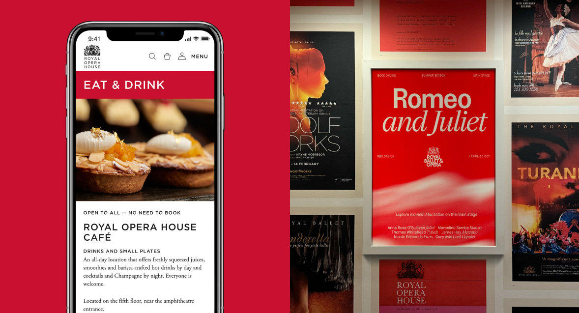
- Starting with a mobile-first mindset. This doesn’t mean designing only for phones—it means prioritising the most constrained environment first. Smaller screens force clarity: you focus on essential content, simplify navigation, and reduce visual clutter. Once that foundation works, scaling up to tablets and desktops becomes an exercise in enhancement rather than compromise.
Techniques like flexible image containers, responsive image attributes, or adaptive loading to ensure visuals look sharp without hurting performance. Large, unoptimised images are one of the fastest ways to degrade the user experience on mobile devices.