
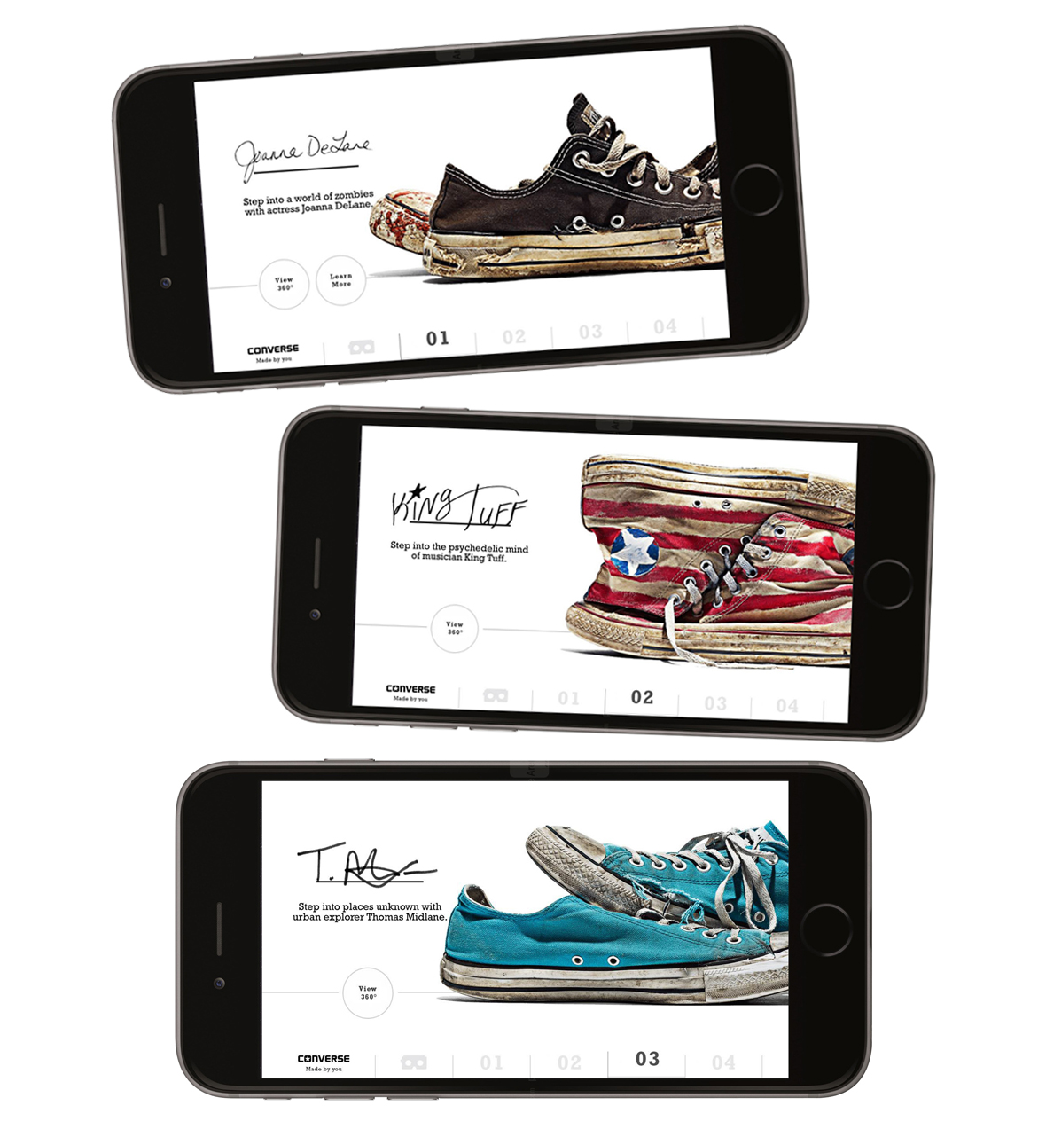
- Taking assets supplied and reworking for various sizes for Digital and Print. Working with UX team to design a mobile experience for the campaign.
- Organising a large amount of digital and print design sizes ready for delivery
- Image editing and touchup
- User interface for mobile app
- Iconography and typography
Skillset: UI and Graphic Design
Agency: M+C Saatchi
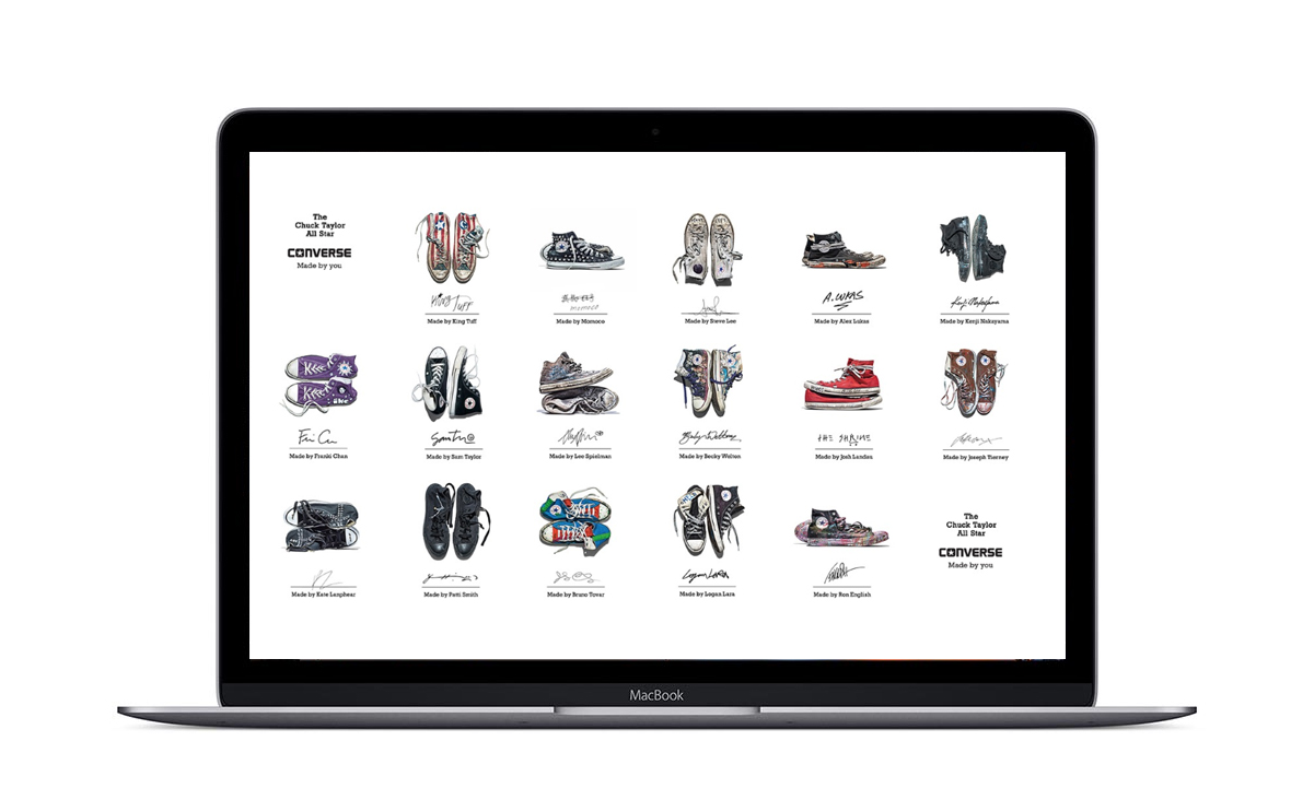
Client: Converse
Deliverables:


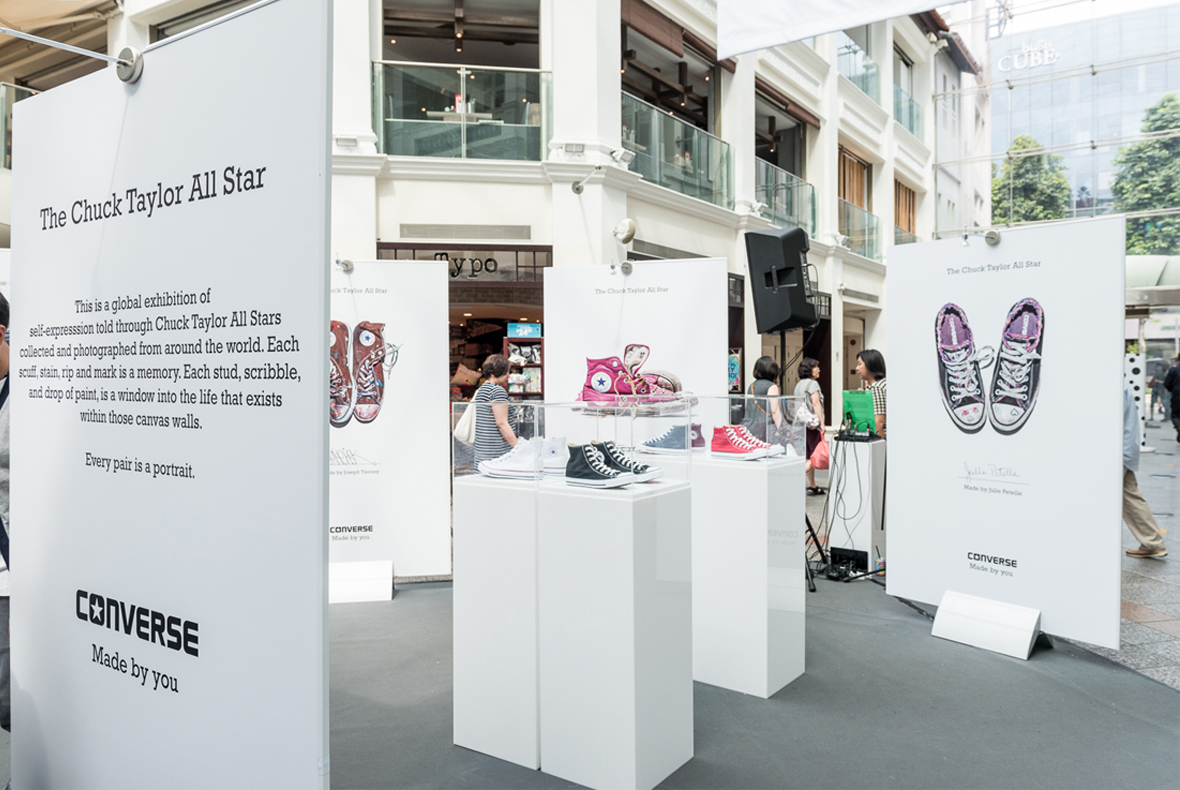
The project began with an looking into large-scale print applications such as billboards, exhibition graphics, and architectural wraps done in the past by Converse. This research highlighted how audience interaction differs from smaller formats—designs must communicate quickly, often from a distance, while maintaining visual interest up close. Case studies informed decisions around typography size, colour contrast, and compositional hierarchy.
The final design demonstrates an understanding of scale, clarity, and audience engagement. Reflecting on the process, the project emphasised the importance of simplicity, strong visual hierarchy, and technical precision when working in large-scale formats at high volume.
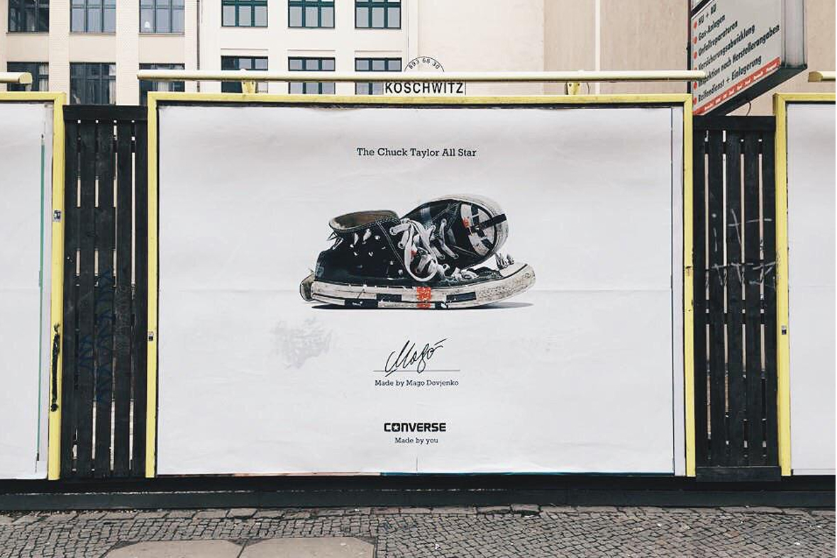
Designing for large-scale print media—like billboards, banners, trade show graphics, and building wraps—requires a different mindset than designing for screens or small-format prints. The sheer size, viewing distance, and production constraints all shape how my designs come together. I find simplicity, precision, and context awareness are what separate something that merely fills space from something that truly communicates.
Focusing on clarity over complexity. Large-scale prints are usually viewed from a distance, often quickly, and sometimes in motion. That means your message must be instantly legible. Use bold typography, high contrast, and minimal wording. A good rule of thumb: if someone can’t understand the core message quickly, it’s too complicated.
